Carbon for IBM Products website redesign
Role: design lead
Jan 2024 - Oct 2024
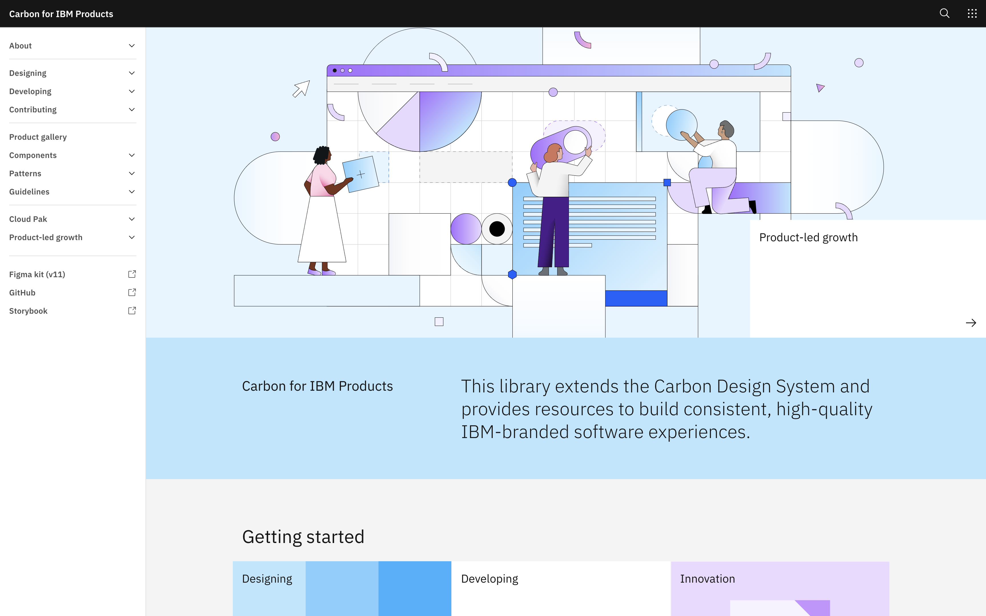
The Carbon Design System website is known for its clean,
structured approach to documenting IBM's open-source components
and patterns. But behind the scenes lies a more complicated
library called Carbon for IBM Products, which houses additional
assets used by over 50 product teams. Until recently, this rich
library of components and patterns was a community based effort,
often led by the needs of products and maintained on a volunteer
basis. However, as a result of this model, the Carbon for IBM
Product documentation site became riddled with outdated content,
broken links, and an incoherent information architecture (IA). It
was time to clean up the mess and create a long-lasting, stable
maintenance solution.
I took the lead on overhauling the site. We needed a clear
roadmap, a better IA, and a sustainable process that included
quality control. First, though, it was important to consider
my team's composition. Several members had invested significant
effort into building the old website or fostering a volunteer
community. Additionally, most members were unfamiliar with using
an Agile process. The challenge was securing buy-in for a
structured workflow without alienating those with a vested
interest in the previous system. With this in mind, I led
discussions of our technical debt, current website architecture,
and content history. I also established the owners of the old
website as subject matter experts to be consulted throughout the
process. I then proposed a roadmap that was considerate of our
team's bandwidth while also ensuring the website overhaul would
have a large benefit to our team and users. I broke each piece of
work down into issues that could be refined and sized. Later when
reflecting on this structured approach, a senior visual designer,
Olivia Flory, mentioned that “we often utilized Aubrey's roadmap
and the phases of work she laid out to keep our team aligned.”
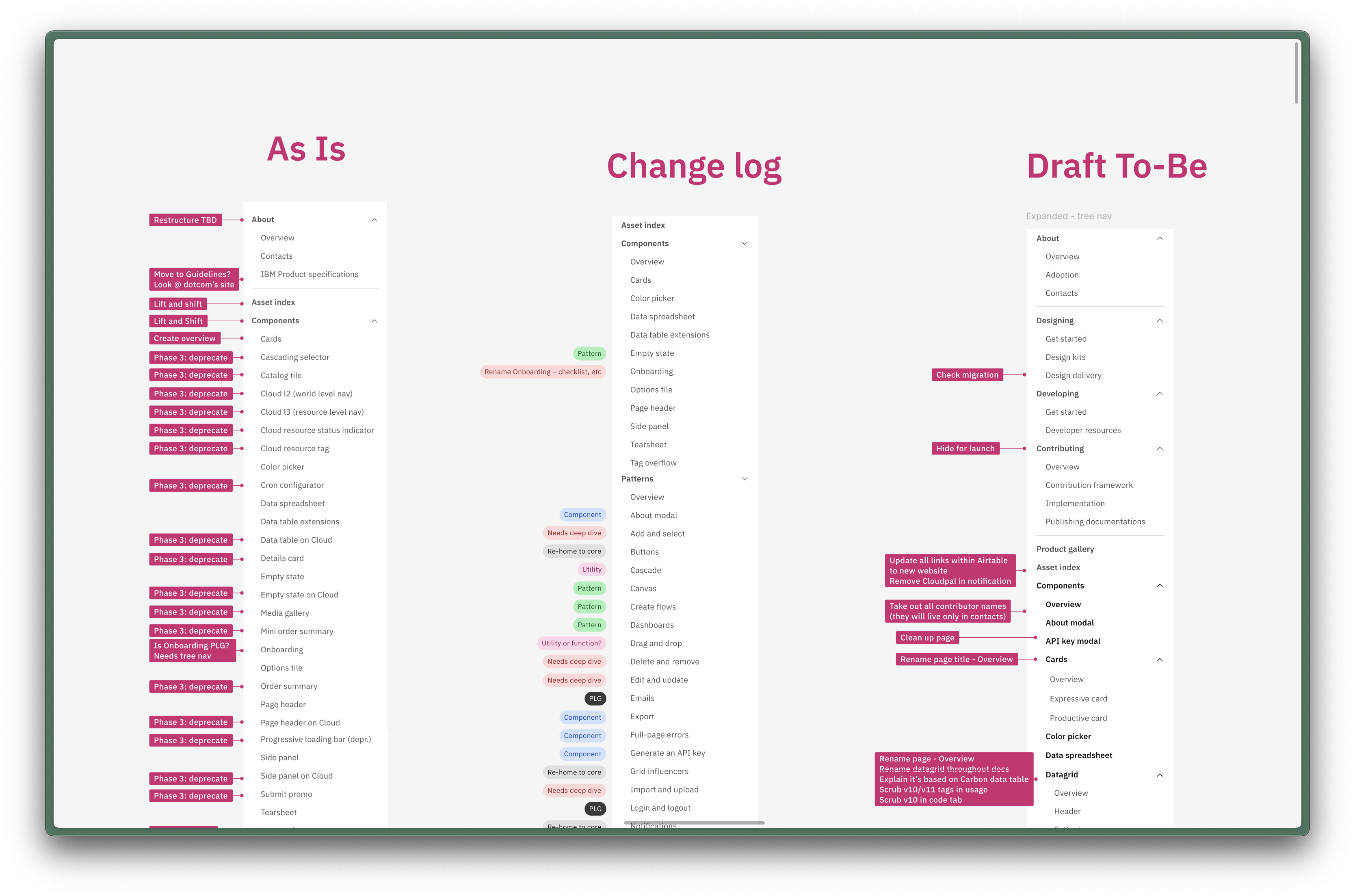
One of my biggest priorities was advocating for an IA where every
page had a home that was predictable to the user. After several
design iterations, it became apparent that a three level left hand
navigation would benefit our IA goals and was the most well
regarded during user testing. At first I received push back from
leadership, saying that we didn't have the developer capacity to
create a new tree navigation component. I gathered more compelling
evidence of its need, put together a package of prior work, and
sized the effort with several developers. This time the proposal
was approved. One quote from a senior content designer, Tom
Waterton, underscores the impact of this approach: “The new
left-hand nav structure is about 100 times easier to navigate now.
This is amazing. I've wanted this for years!” This new component
also proved useful the following year, when it was implemented
into a global navigation shell for all strategic IBM software
products.
Next, we tackled the site's bloated content. We fixed broken
links, deleted 200 hidden pages, and hundreds of images. In total,
we cut about 30% of unnecessary content and incorporated
accessibility statuses for the remaining components, making the
site leaner and more trustworthy overall.
In the process, I also helped restructure our GitHub documentation publishing process by collaborating with UX Engineer Manager, Elysia Hwang. Together, we improved site builds by reducing build times, adding pull request previews for easier reviews, and trained a group of dedicated designers as code owners to oversee community contributions.
Finally, we created Carbon Labs to separate experimental work from stable design system assets, reducing confusion about production-ready components. This dedicated contributor space includes a GitHub repo, Storybook for code, and Figma for design. Once an asset meets our new definition of done, it graduates to stable and can be published on the Carbon for IBM Products website. And to keep documentation clean going forward, I introduced standardized templates in Markdown and Figma, giving contributors a structured, scalable way to document new patterns and components.
This project wasn't just about fixing a messy website—it was about
shifting how the Carbon team and its community work together in a
sustainable, maintainable manner. The result? A documentation site
that actually works. It's faster, more navigable, and finally
meets the needs of the teams that rely on it. Additionally, our
new Carbon Labs contributor approach allowed us to immediately
support contribution of several high velocity projects, such as a
global header. Rich Kummer, senior product designer on the squad,
summed up my impact on this project: “[Aubrey] truly shines when
she's guiding initiatives at scale. She was able to break down and
scope the work so that the team had a clear path forward.”